Here come the playoffs: what’s your theory?

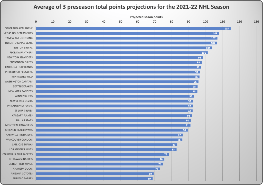
With just a couple of weeks left in the NHL regular season, everyone is in hard playoff prep mode. I’m no exception. This is the time of year I like to ask myself a simple question: what’s my theory about which teams will out-perform the rest starting in game 83? Why does this question matter? Like in science, we all need a good theory to guide our decision making. Whether you are betting on hockey, playing fantasy, write a hockey blog, or just watching the games from the front of your seat, we all want to prognosticate the playoffs despite how hard it is to do. Who saw the Montreal Canadians in the finals last year? Not many. But what theory, if held then, would have lead to the right prediction? What about the unexpected appearance of the Vegas Golden Knights in the finals in their inaugural campaign? Thinking theories allows us to deepen our knowledge of the underlying dynamics of the game of hockey. Stating your expectations before the race for the cup starts allows us to test our understanding of those dynamics. What matters most in the playoffs? Is it the hot goalie? Team speed? Defensive prowess? A hot streak down the stretch? Now is the time to put our cards on the table.

Have a look at this simple table that lists my top 6 theories for predicting playoff success. For each theory, there is a brief description along with a few of the key metrics for ranking teams, and a tentative list of the teams that can be expected to excel if the theory is true. What order would you put these theories? What theories are not here? Send me some feedback!

Theory:Description:Key metrics:Teams that should do well*:
1. The hot goalieThe hot goalie going into the payoffs or the goalie that gets hot.5-on-5 save %, Goals saved above expectation, goals against averageRangers, Flames, Lightning, Predators, Avalanche (dark horse)
2. Best team DDefense wins championships. Goals get more scarce in the playoffs. Shot suppression is the key. Shots allowed per game, goals against, penalty kill %, blocks per gameHurricanes, Flames, Rangers, Avalanche (dark horse)
3. Scoring machineryScoring amidst the intensity of playoff hockey is different. The team that can generate shots and chances have the edge.Goals for (and per game), power play %, CORSI forPanthers, Maple leafs, Avalanche, Wild, Blues (dark horse)
4. The power of special teamsPenalties get scarce in the playoffs. That means the teams that score with the extra man when chances are reduced have a leg up. A poor PK is a death sentence when overall scoring goes down. Power play %, short-handed face-off win %, Penalty kill %Maple leafs, Rangers, Blues, Oilers, Hurricanes, Penguins (dark horse)
5. The bruisersPlayoff hockey is big boy hockey. At the end of the day, the team that dominates physically has the edge over teams that feature speed and finesse. Average player size, hits and blocks per gamePredators, Bruins, Lightning, Rangers, Panthers, Golden Knights (dark horse)
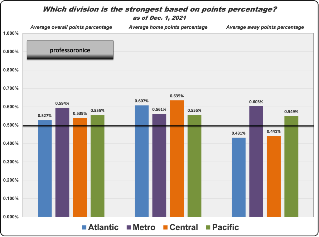
6. Road warriorsIn the playoffs, home ice advantage is a real thing. Many matchups come down to which team can win a key game in the other team’s barn. Staying cool on the road tests a team’s mettle. Road points %, Regulation road wins, road goal differentialCapitals, Rangers, Avalanche, Panthers, Flames, Penguins (dark horse)
*Rankings in this table are based on current statistics based on listed key metrics

How predictable is the NHL? Comparing preseason projections to current points pace in the NHL

How good are we at predicting what will happen in the NHL? My answer: the experts are not very good. That depends on what you expect. Professional hockey is interesting in part because game play is highly influenced by stochastic factors that defy prediction. My own view is that the most predictable aspect of NHL hockey is the “rule of thirds”: We know at the beginning of the season that approximately a third of teams will perform about as we predict, a third of teams will over-achieve and a third of teams will under-achieve. The problem is that we aren’t good at predicting which teams will end up in which box.

Before this season started, I collected and analyzed three highly ranked total season points projections. They were from Vegas [1], Evolving Hockey [2], and The Athletic [3]. Here are the average of these three projections, all issued during pre-season:

So, now that all teams have played at least 50 games, let’s look at how the teams are doing in terms of points pace compared to these projections. To do that, I made some graphs where I projected point totals for the season based on total team points percentage as of today. I call that season points pace. It’s not perfect in the sense that using points percentage doesn’t give a clean estimate of what will happen in 3 point games. There is some over-prediction of points in this calculation. With that in mind, let’s look at how these preseason projections compare to current points pace:

This graph is ordered by a team’s rank in preseason projections. I think this graph is pretty cool. I applied the rule of thirds and put teams into 3 boxes (over-achieving, under-achieving, and teams on track to meet projections. My decision rule is 10 points above or below). What we end up with is close to the rule of thirds: 11 teams (34%) are over-achieving; 8 teams (25%) are underachieving, and 13 teams (41%) are on track to be within 10 points of preseason projections. The average difference is -0.7 points because, hey, hope springs eternal. The teams that are under-performing are (in many cases) under-achieving in a big way. This list is topped by Seattle (-38) and Montreal (-41). Other notable dissappointments include Vegas (-10), the Islanders (-20), New Jersey (-27), the Flyers (-28), Chicago (-20) and Arizona (-20).

Among over-achieving teams, the biggest surprise may be Carolina, now on pace for a 122 point season. Among the 10 highest rank teams from the pre-season, half are exceeding expectations. Call this regression away from the mean. The Avs are on a blistering pace heading toward greater than 126 total points based on current point percentage. Tampa, Pittsburgh, the Rangers, Blues, Flames, Kings and Ducks are all significantly out-performing predictions.

So, what are the patterns here? What have we learned? This is where the interpretation starts. One obvious thing to say is that Seattle tells us that Vegas was really weird. Expansion teams struggle. The other big pattern I see is that goalie performance is not appropriately taken into account in preseason projections. Most of the over-performing teams are getting better than expected goal tending (think Rangers, Flames, Penguins and Kings). Under-performing goal tenders in Vegas, Montreal, Philadelphia, and Chicago help explain the blue bars. It’s a cheap insight but the gap between preseason projections and team performance seems to be heavily influenced by the one position in hockey that most defies prediction. Preseason projections could improve if we had better models for estimating goaltender performance.

What do you think?

Sources of predictions:
[1] Vegas: https://novacapsfans.com/2021/08/31/vegas-releases-standings-points-projections-for-each-nhl-team-for-the-2021-22-season/
[2] Evolving hockey: https://evolving-hockey.com/blog/2021-2022-nhl-team-point-projections/
[3] The Atlantic: https://novacapsfans.com/2021/08/31/vegas-releases-standings-points-projections-for-each-nhl-team-for-the-2021-22-season/

Is parity really at peak? Let’s ask the data

I have been a scientist for 30+ years. What makes the scientific enterprise so valuable is that it sheds a bright light on our cherished assumptions, providing a chance to scrutinize what we believe by quantifying phenomenon of interest. My heroes are scientists who reveal truth where assumptions pervade. As a scientist and hockey fan, I wrinkle my brow every time I hear commentators and analysts say that parity is at peak in the NHL. The NHL is credited by many (see for example the 2019 commentary in The FlightCast) as being the league that has done the best job of maximizing parity (which we can define as evenly distributed talent and winning opportunities across teams). Every time a weak team beats a top team, the parity talk follows. Last night, the lowly Coyotes beat the mighty Leafs, and today, we hear renewed talk of how much parity exists in our league. If I had a nickel for every time I have heard people claim peak parity I could buy an ice-front ticket.

The truth is that league parity is very easy to measure rigorously. Statisticians have a very simple metric for determining the average variation in a set of numbers. It’s called the standard deviation. It measures how spread out a group of numbers are. We can look over time at the standard deviation of team points or goal differential as a solid way to quantify parity. When parity is high, points and goal differential will be low, with most teams clustered around the average. When parity is low, teams are more spread out and the standard deviation will be higher. So let’s look at the data for the NHL since the 1990-91 season.

One limitation of the standard deviation is that it isn’t directly comparable between sets of numbers based on different sample sizes. As a result, I dropped the 1993-94 and 2012-13 season because there were only 48 games played. Fewer games means an artificially lower standard deviation because teams don’t have as much opportunity to spread out. With the exception of 2019-20 (71 games) and 2020-21 (56 games), all other seasons saw at least 80 games. There are three lines on this graph. The red line is the trend in parity based on the standard deviation (SD) of team overall goal differential. The blue line is the SD for overall team season points. The purple line is a trend indicator based on a 3rd-degree polynomial spline. For all these lines, lower numbers mean higher parity (or less spread out data). So what do we see in these data?

The first thing to say is that parity was at its lowest in the 1992-93 season. That year, the Penguins won the President’s trophy with 119 points while the lowly Senators and Sharks amassed a scant 24 points over 84 games. Between 1990 and about 2008, there was a stead increase in parity across the league (based on the purple trend line). The peak in parity occurred in the 2007-08 campaign (lowest SDs). That year, the President’s trophy went to the Red wings (115 points). The parity peak came from a relatively strong performance from the bottom dwelling teams. That year the Lightning and Kings were the worst teams at 71 points. Parity reached a second highest level in 2015-16 when the Capitals surged to 120 points, with the Maple Leafs at the bottom with a respectable 69. We have to be a bit cautious about interpreting the numbers in the last two COVID-impacted seasons because those numbers are based on only 71 and 56 games respectively. Given that fewer games biases toward higher parity, the last two seasons reflected far less parity compared to 2007-08 or 2015-16. What drives parity in the NHL is the performance of the worst teams, not the teams at the top.

There have been three big changes in the NHL since 1991 that explain the gains in parity. Two of them were explicit league interventions designed to boost parity. The first was the addition of 9 expansion teams in the decade between 1991 and 2001. More teams in theory would be expected to reduce parity. The second major change, and one that was explicitly intended to enhance parity, was the salary cap. Both the 1994-95 and 2004-05 NHL lockouts were fought over the salary cap. The NHLPA finally agreed to a “hard” cap at the start of the 2005-06 seasons. The salary cap did more than anything else to level the playing field in hockey and put the lid on NHL dynasties. That last factor was the introduction of the shoot-out and the elimination of ties, also after the 2004-05 lockout. The loser point introduced by this change has driven parity up by introducing more variance.

In summary, there was a trend toward rising parity from 1990 until about 2007, driven largely by the salary cap and the “loser” point. The NHL’s efforts to boost parity worked. However, in the last decade parity in the NHL has gone up and down with relative stability. The claim that parity is now higher than it’s ever been is simply wrong.

Tort’s law: Why norms are worth preserving in hockey

John Tortorella in studio
John Tortorella on SportsNet, December 10

The comments of John Tortorella about the Zegras/Milano play have caused a kerfuffle in the hockey world. Why have his comments struck such a deep nerve? What really motivated his remarks? Is he a dinosaur who should be censored? Where is the game going? Let’s start by looking at exactly what Torts said:

“I think our game has gone so far away from what our game should be. A hard game, an honest game. It’s almost gotten too showman. I know you need to have it — you need to sell the game, but I’m from the ilk — it’s still a hard game, and a good, honest hockey game needs to be played. I think with some of this stuff, we get carried away.”

– John Tortorella, SportsNet broadcast, December 10, 2021

I’d like to weigh in here, not as a hockey fan, but as a social scientist. Many have gotten distracted by questions about whether the play in question is or should be against the rules of the game. That, in my view, is a red herring. We need to make a distinction between the rules of the game vs. the norms or the game.

Social scientists love to talk about norms; we generally agree that norms are more powerful than the official rules. Norms are the unwritten codes of conduct that fill in the gaps between the rules. When the norms of a given field of endeavor are violated, strong emotions are stirred. It’s tricky because norms are often hidden, powerful but unwritten. Hockey is a sport that cherishes its norms and protects them ferociously. It’s one of the things that makes our game special. In my view, Tortorella’s comments are a perfect example of what happens when young players do something that violates a cherished norm. That’s what made his comments important and incendiary. So what norm did these kids violate? What unwritten rule did they break?

In hockey, we don’t do things that embarrass the other team!

That, I think is what Torts objected to. That is why former players said that Zegras and Milano should have “their heads taken off”. That’s the “showman” quality that raised the hair on Tortorella’s neck.

This norm has a long history in sports. Babe Ruth was traded from the Red Sox to the Yankees in 1919 after 6 seasons. We all know how this trade was later blamed for the epic curse of the bambino. There are many theories about why the Red Sox let Ruth go, but one factor was that he had broken the all-time record number of home runs the year before the trade. At that time, the norm is baseball was that homers were distasteful because the long ball denied the other team a fair chance to defend. The Red Sox were embarrassed by the number of home runs he was hitting. Over time, that norm shifted, and the Red Sox came to regret the trade. This illustrates how powerful norms are in sports as well as how they gradually change over time.

In hockey, players are under constant threat of pain and injury. Responses to this threat are profoundly dictated by the unwritten norms of the sport. Think about how the norms differ in hockey vs. football (aka soccer). Every collision in soccer results in a player rolling around the grass, grabbing their knees and writhing in agony. Stretchers are dispatched with medical teams, injured limbs are sprayed with ointments, and then the player pops up and continues the game with the hope of benefitting from a penalty. It’s a peculiar theatre that bugs hockey fans. In hockey, players never writhe, stretchers are rarely deployed, and blood and injuries are silently endured. Do we want hockey to be more like soccer? Few do. What makes hockey special are these norms, not what’s in the official rule book. These norms are important to protect. They do shift and change over time, but Tortorella is acting in defense of a cherished norm. Flashy plays feel dangerous to him. I get that. I don’t like all the norms that dictate our game but I know that norms shift gradually on their own terms.

We need Tort’s law to keep hockey special.

Which NHL division is the strongest so far?

One ongoing interest I have is comparing the strength of the NHL divisions.  Now that we have passed the Thanksgiving break and most teams are at 20 games, it’s time to take a look.  Here is my analysis and it is a surprise.  Have a look at this graph.  There are three different answers to the question of which division is the strongest (overall goal differential, and expected points in and out of the division over an 82 game season based on performance so far). 

Based on all three metrics, the metro and pacific divisions right now are the strongest.  The Atlantic and Central both have negative goal differentials and at least 10 fewer expected out of division points compared to the Metro. I believe the out-of-division points expected is the best overall gauge of a division’s strength. Based on that, I’d give the edge to the Metro right now. Points are hardest to come by in the division (right side) and Metro teams are outpacing the others outside their division. What do you think?

Let’s look at one more graph. This time, it’s average points percentage overall and home vs. away. Points percentage is the percentage of total points that could be won that are, taking account of overtime and shootout losses. Similar story here as the Metro is taking the highest points percentage at 59.4% of available points. More significantly, they are the only division taking over 60% of the points when playing away. There is overall a home-ice advantage in the NHL; except when a Metro team is in your barn. Right now the Metro is the strongest division.

PS: If anyone looked at this page before December 2, you will notice that the figures changed. My original posting contained an error from my spreadsheet that made it appear the Central was the strongest. I apologize for the error.

The biggest mystery in hockey: why have goals gone down since the 80s?

Here is a question for hockey people. There are two massive changes that have impacted hockey over the last 30 years. The first is the shift from wood sticks to more flexible, lighter composite sticks. The Great One set records for points and goals using the old wooden sticks, at least until the arrival of the aluminum shafted stick in the 1990s. Everyone agrees that the new sticks are a big change, both for skaters and goalies. The new composite sticks offer significantly more control, power and precision compared to the old wooden sticks. Second, after the lockout, the NHL introduced Rule 55, ushering in a zero-tolerance policy for hooking, holding and stick violations. The objective of Rule 55 was to unleash the scoring power of the high skill players. Both these changes are hard to underestimate. Both should have increased average scoring in the NHL. Is that what happened?

Have a look at the chart I made today. It’s pretty interesting. It shows the average goals per game for each NHL season from 1980 till today (the blue bars) and the average number of power play goals per game (red bars). The golden age of scoring was in the early 80s. Goals per game peaked at over 4 during the 1981-82 season. That was the heart of the wooden stick/hocking & holding era! Average goals per game stayed above 3.5 until 94-95. The first composite blade wasn’t introduced till 1995. In 2001, the first 1-piece stick was introduced. Scoring fell consistently during the switch from wood to exotic materials. How could that be? After the lockout, rule 55 stimulated a third of a goal per game rise in scoring. Power play goals spiked to over 1 a game in 05-06 only to fall by half a goal a game by 2013. Average goals per game rose from 2.77 to 2.97 in 2017-18 and briefly jumped over 3 a game in 2018-2020.

It is really weird though that composite sticks and the end of hooking and holding resulted in LESS rather than MORE goals. Why is that? I think it’s one of the biggest mysteries of hockey. NHL players have gotten stronger, faster, bigger and more skilled. Their sticks are lighter, more powerful and easier to control. Despite those shifts, average goals per game is about 1 less than it was in the early 80s. There must be something bigger, more potent that is working against the push for higher scoring.

My theory? As the average skating speed of players rises, the effective distance between players shrinks. Faster players on the same size ice means the amount of open ice declines. This, coupled with increased team commitment to defense, means that puck possession and control gets harder. While everyone knows that lighter more powerful sticks improved shooting, they also dramatically improved defense! Lighter sticks help defensemen as much as they do shooters, possibly even more. Faster skaters close the gaps between attackers and defenders, creating less open ice, and forcing more puck chaos.

When are we going to get the speed and possession-level data that will let us study this stuff?

The NHL 2018-19 awards by nationality: a sign of waning North American dominance?

The 2019-20 entry level draft is finally behind us and everyone is talking about the tremendous success of the U.S. national team development program.  The U.S. tied Canada with 11 players in the first round. Overall, the U.S. and Canada drafted 124 of the 217 players drafted this year and 22 (71%) players in the first round.

Looks like North American dominance of the NHL is on solid ground, right?

Consider however the results of this years NHL awards.  A couple of things to notice:

  • North American players won only 1 of the big seven awards (excluding Jack Adams).
  • Since the 1999-2000 season, North American players have averaged nearly half of the awards won (3.7).
  • In only 1 other year since 1999-00 has North America garnered only 1 award (2011-12).
  • This is the third year that Russian players won 4 awards (07-08, 08-09).
  • This year marks the 12th year since 1999-00 that an American player has not won an award (and the second consecutive year).
  • This is only the second season (after 2011-12) where 6 of the awards went to non-North American players.

The NHL has always been an international league.  North America (and the U.S.A. in particular) continue to demonstrate dominance at the doorway to the league.  However, at the most elite level, the rest of the world is catching up. 

That’s a good thing for the game.

Are we headed to a salary bubble in the NHL? One way to look at recent salary inflation

Salaries are rising in the NHL and rising fast.  The cap has gone up but slower than many hoped.  It’s time to wonder whether things are moving too fast for the long term health of the league.

How would we know if it’s getting nutty (or more importantly, unsustainable)?  One simple idea I had was to compare the value of players signed in the last few months to a few select, undisputed high value players from a few years ago using a metric that allows an apples-to-apples look.

To do this, I used data from NHL.com and CapFriendly to compare what teams will be paying players in 2019-2020 in AAV dollars per point scored per season.  Here is what I came up with:

Dollars per point (6-20-19)

The details:
The blue bars represent players “gold-standard” high-value players who signed standard contracts between 2012 and 2016 (signing dates in blue above).  The green bars are all the standard (not entry-level etc) contracts for forwards signed since March 1, 2019.  To maximize comparability, I took games played and total points scored for the past 3 seasons and estimated an average points scored per season weighted to assume each player played the same number of games (82).  The dollar values are the AAV for the 2019-2020 season based on CapFriendly.  No performance bonuses were taken into account.  My method differs from CapFriendly’s way of computing dollars per point. 

So what do we make of this?

The most recent (standard) contracts signed for forwards in the NHL have been consistently higher in AAV dollars per point than even the best-of-the-best from the recent past. 

Lets look at how teams are paying recently signed players compared to Sid Crosby, who all would agree is a high-value player.  All but 2 of these forwards are making more per point than Crosby.  That does tell us there is some variability in player value in the newest contracts.  On the other hand, its worrisome for the league that players like Duclair and Janmark are now making comparable dollars per point. 

Three contracts really stand out here.  Teams are paying Kevin Hays (46% more), Jeff Skinner (69%) and Brock Nelson (50%) around fifty percent more per point compared to Crosby.  This signals a salary inflation that doesn’t match the rise in the cap. 

How long will it be before  valuations for top players become so out of whack that teams are unable to round out their rosters with lower priced talent? 

Obviously, salaries are going up and they should.  But, what does it mean for the league when solid NHL players are making 50% more per point than super star gold standard players? 

Using this metric shows the salary inflation in a different light by putting salaries in the context of value (at least as far as points). 

I believe the NHL is headed toward a bubble.

The Details:
Blue bars represent selected “gold standard” high-value players who signed standard contracts between 2012 and 2016 (signing dates on top in blue). Green bars are all the standard contracts signed since March 1 2019 for forwards. To increase comparability, I took games played over the past 3 seasons and total points scored to create and average points scored per season. That number is prorated to simulate what each players average point production would be if each had played 82 games each season. Data come from NHL.com and CapFriendly.com. My method differs from the method used by CapFriendly to estimate dollars per point scored. My method ignores performance bonuses.

Sure-handedness: A New Statistic We Really Need

In hockey, there is a whole family of statistics we really need to evaluate talent and make predictions that we can’t get because the data is so hard to acquire.

This is especially true of goalie performance. Blah blah blah.  Let’s save that for later.

We are now in the “NEW NHL” (whatever that means).  At least it means the rising importance of team speed, higher value of skill play, and, most importantly, puck control.  If Team A has control of the puck the entire game, it only makes sense that the other team is less likely to score.

We lack decent statistics to inform us about how well teams do the NEW NHL.  We can track team time of possession, which is fine, but that doesn’t tell us about the value of individual players in grabbing, holding and advancing the puck control agenda.

I propose a new statistic I will call player sure-handedness.  It’s a simple idea.  Let’s track each time a given player on the ice takes possession of the puck during gameplay.   Once player X takes possession, what he or she does with it has a great deal to do with whether good things happen or whether puck control will shift to the opposition.

Continue reading

Which is the Strongest Division in the NHL? I Know the Answer!

I listened intently to the talking heads of the hockey world all summer and during the nascent 2018-19 season. At some point, I have heard some luminary proclaim all four of the divisions as the best, toughest, most competitive division. There are no easy games X4. Parity is the new religion of the NHL. But that seems sloppy to me.

So which division is the most challenging? Some say it’s the Atlantic. Others say the Metro. Others will say the Pacific or the Central. If we consider all of the 2017-18 season from a data standpoint, what question could we ask to address this question more systematically?

Continue reading