It’s true, I am a Penguins fan. I’m Steel City proud when I hear commentators say that the Penguins have been the “hottest team” in the final stretch of the season. But what does this really mean? In baseball, everyone looks at team performance over the last ten games. Sometimes we see that statistic reported in hockey. But unlike baseball, where games are played about every day, a ten-game period is a longer period of time in hockey. And, knowing that a team is 5 and 5 in the last ten does not tell us much about team momentum. Consider these examples of ten-game trajectories of three hypothetical teams. Note they are all 5 and 5 in the last ten:
| Team A | Win | Win | Win | Win | Win | Loss | Loss | Loss | Loss | Loss |
| Team B | Win | Loss | Win | Loss | Win | Loss | Win | Loss | Win | Loss |
| Team C | Loss | Loss | Loss | Loss | Loss | Win | Win | Win | Win | Win |
As I have argued before, hockey is a cyclical game. There are nights that every puck seems to land on a friendly stick. Opposing goals fill like rabbit cages in springtime. Opposing shots ring off iron. This is a streaky game. So, how do we capture the movement and directionality of those cycles? And how do we track the momentum of a team over a season? I can’t find many good examples of this out there so I invented one myself.
I call it TEAMODEX, or the Team Momentum Index. It’s really quite simple. All teams start the 82-game season with a score of 0. Game 1, your team wins in regulation or overtime (+1 point), loses in regulation or overtime (-1 point), or ties (0 points). That number gets added to the team’s score from the previous game (or from zero at game 1). Next game, same formula. What we get is a kind of moving picture of a team’s trajectory of momentum. Win 3 games in a row, your TEAMODEX has a 3-point rising slope. Lose 5 in a row, and you get a 5-point falling slope. Teams that win and lose in alternate games, end up looking like a zig-zag sewing stitch.
So what does this look like over a season, and is it useful? Below is a picture of the TEAMODEX for the Metropolitan division for the 2015-16 season:
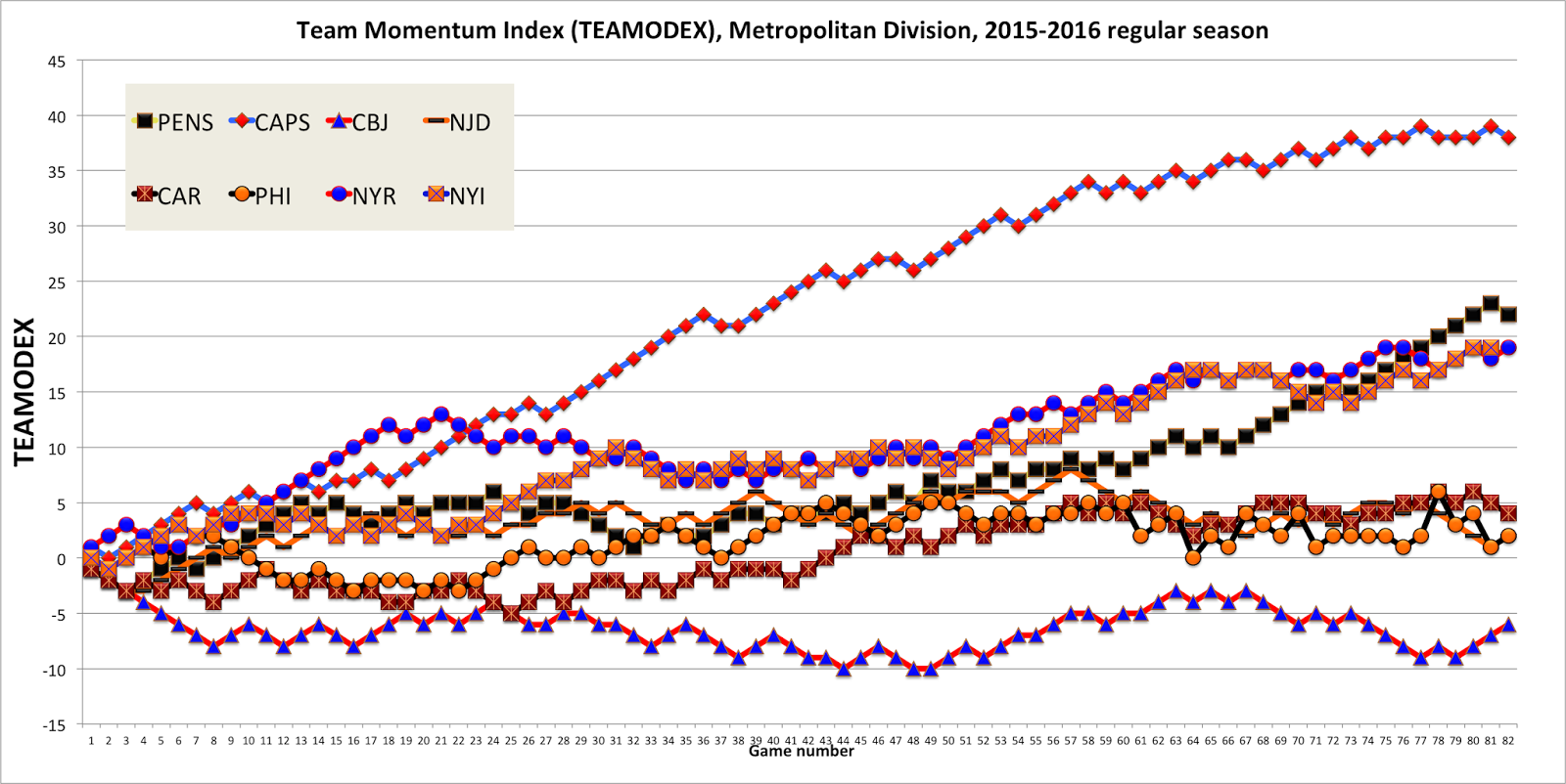
Each team represents a different colored line. Again, upward slope means a winning momentum. Downward slope shows a team that is struggling. Each line has 82 dots which accumulate momentum points over the season.
So what do we learn about this campaign?
As expected, the Washington Capitals had a banner year. Winning a staggering 120 points, the team clearly stands apart in this graph. What’s new is that we can see two impressive features of the Caps’ season. They left the rest of the division in the dust in a sequence of four multi-game win streaks starting in game 27. Secondly, the Caps never had any downturns! On the other hand, if you look at their trajectory in the last twenty games of the season, their momentum was rather average. In fact, the trend shows a pretty flat momentum picture in the last eight games of the year. Not surprising for a team that had already won the prize and had little to play for.
Several teams were fairly slow and steady throughout the year. They stayed close to the zero line, with few streaks hot or cold. The surprising Flyers are the best example. We see two five-game win streaks midseason, but they rarely lost as many. It was an even-keeled performance, capped off with an impressive play off berth, despite a flat MOjectory at the end.
On the other extreme, this picture shows just how deep a hole the Blue Jackets dug for themselves with that early season losing streak. Despite being a very warm (if not hot) team from games 48 to 65, they were never able to catch up from that jack rabbit descent.
This graph gives a perspective on the first round exit of the New York Rangers. They had an impressive start to their campaign, with a division best fire-hot streak between games 6 and 18. By Christmas, it looked like the Rangers were the only team that might best the Caps (they even outpaced Washington on my TEAMODEX). But in midseason, when the rest of the division was flat, the Caps caught fire and the Rangers entered a long lull. From a momentum point of view, the Rangers were overtaken by first the Caps (game 22), then the Islanders (game 31) and finally the Penguins (game 77).
Ah the Penguins, my mighty Pens! What this graph shows more clearly than just about anything I have seen is that the Pens were in fact the hottest team in the Division (if not the league) after game 65. Their momentum slope in the last quarter of the season matched that of the Capitals during their red-hot run midseason.
If you look at total points won, you would have to predict the Caps will take Lord Stanley’s Cup this year. Look at the slope of momentum across the season, and in the last 20 games in particular, and one is left to wonder whether the Cup might come to rest on the other side of the Potomac.
Just saying…
